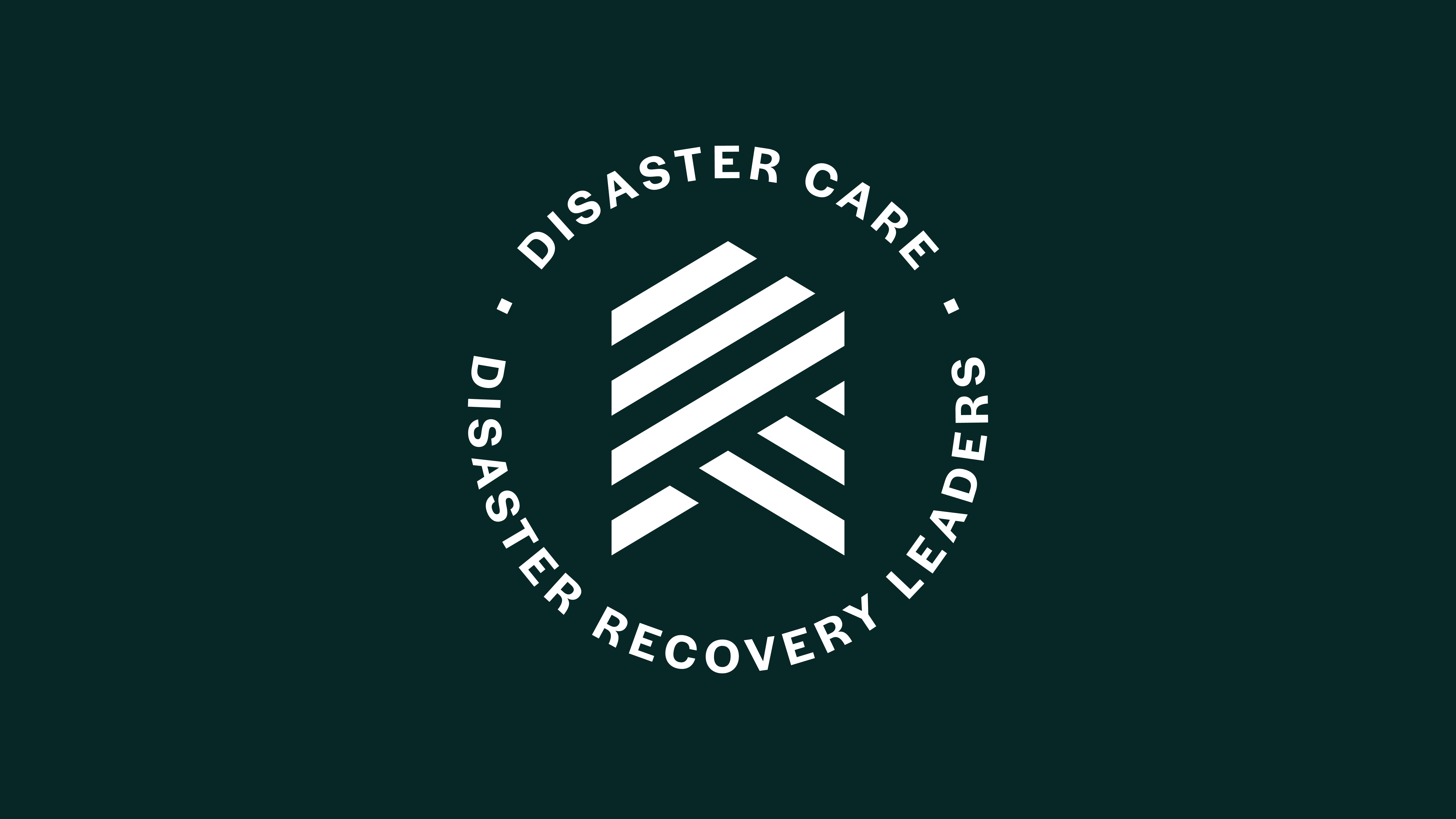
Primary Logo
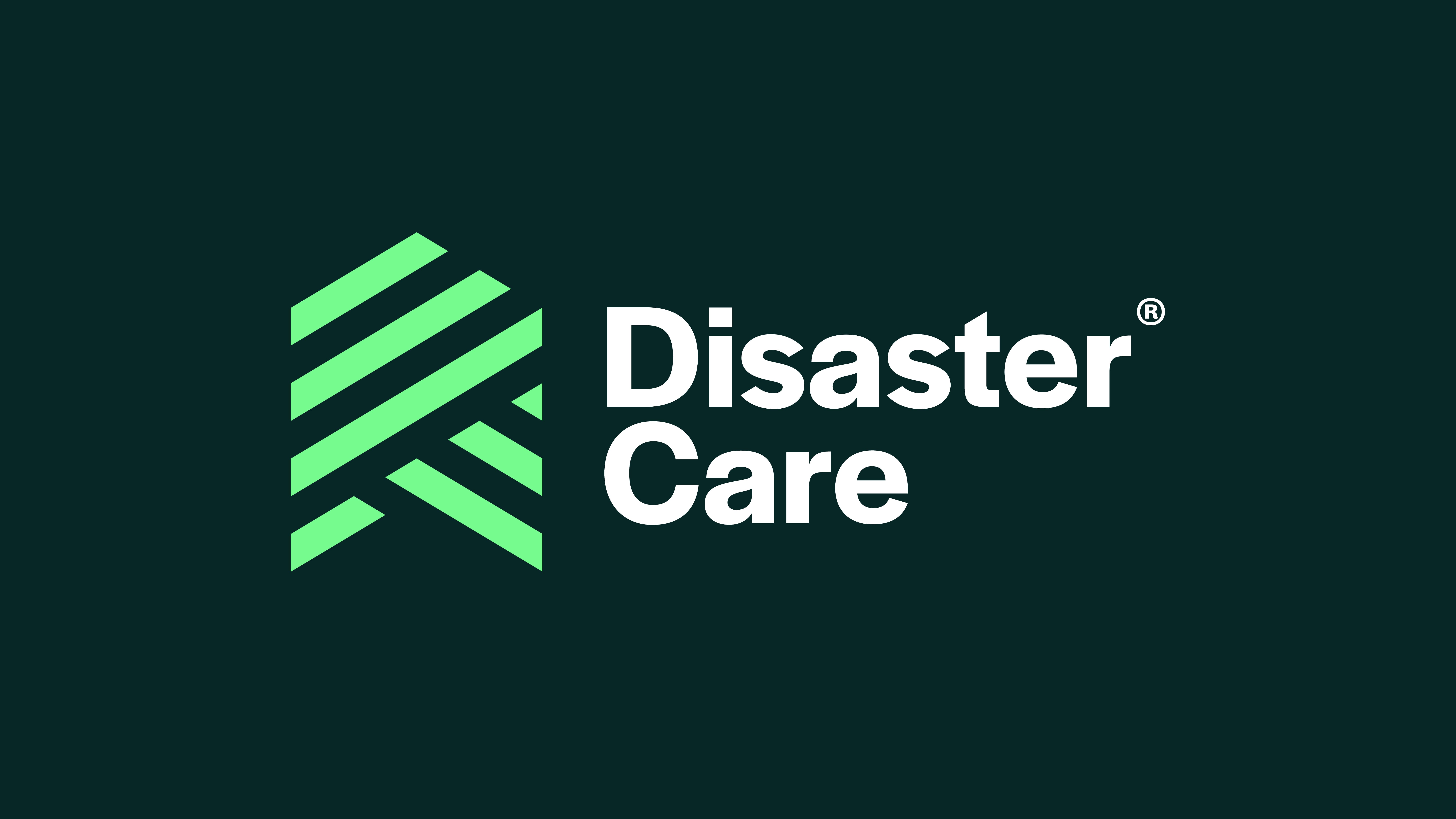
Supplied in the Disaster Care toolkit are multiple variations of the primary logo. All variants should maintain position at the top of the visual hierarchy when producing brand collateral.
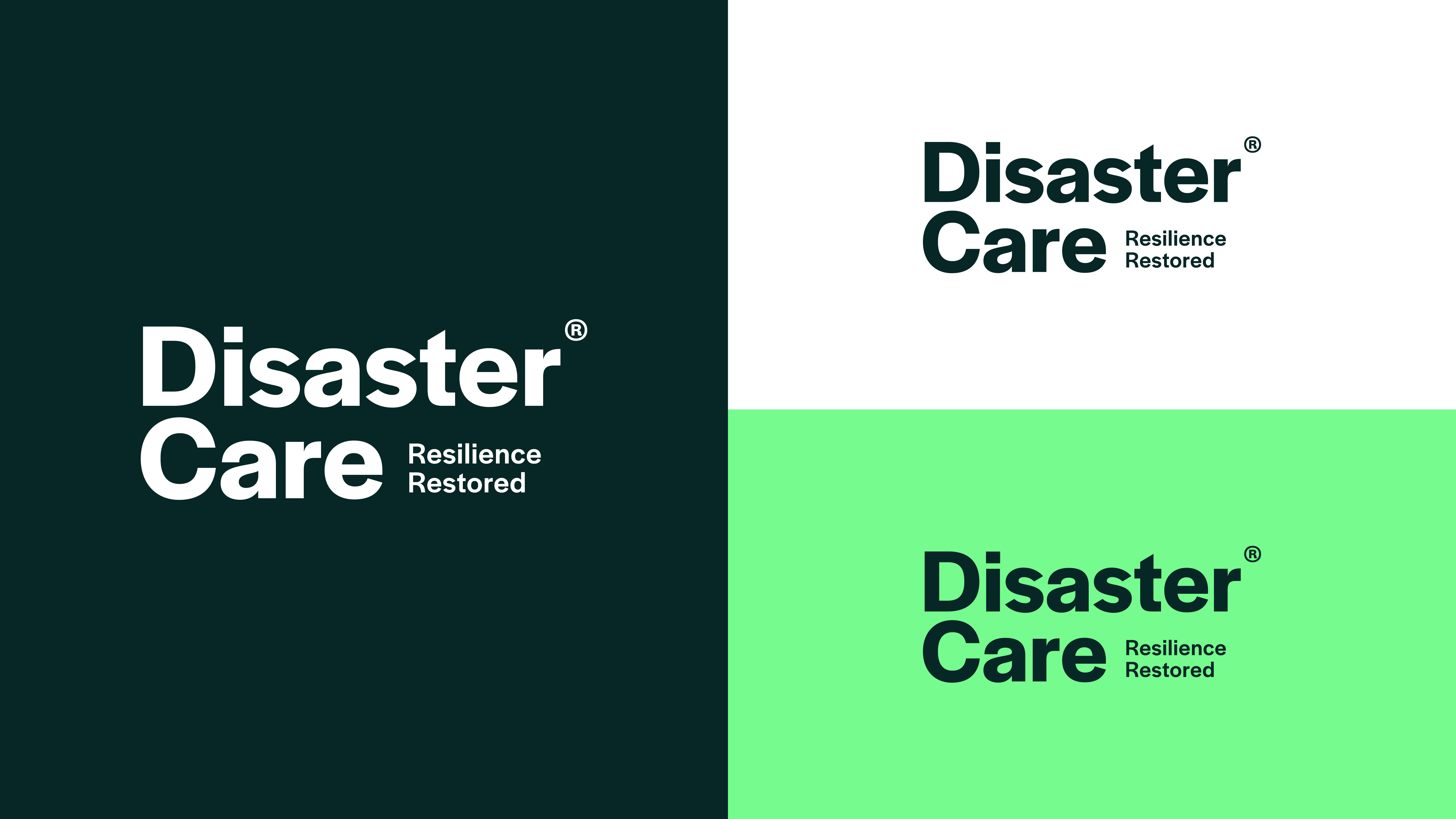
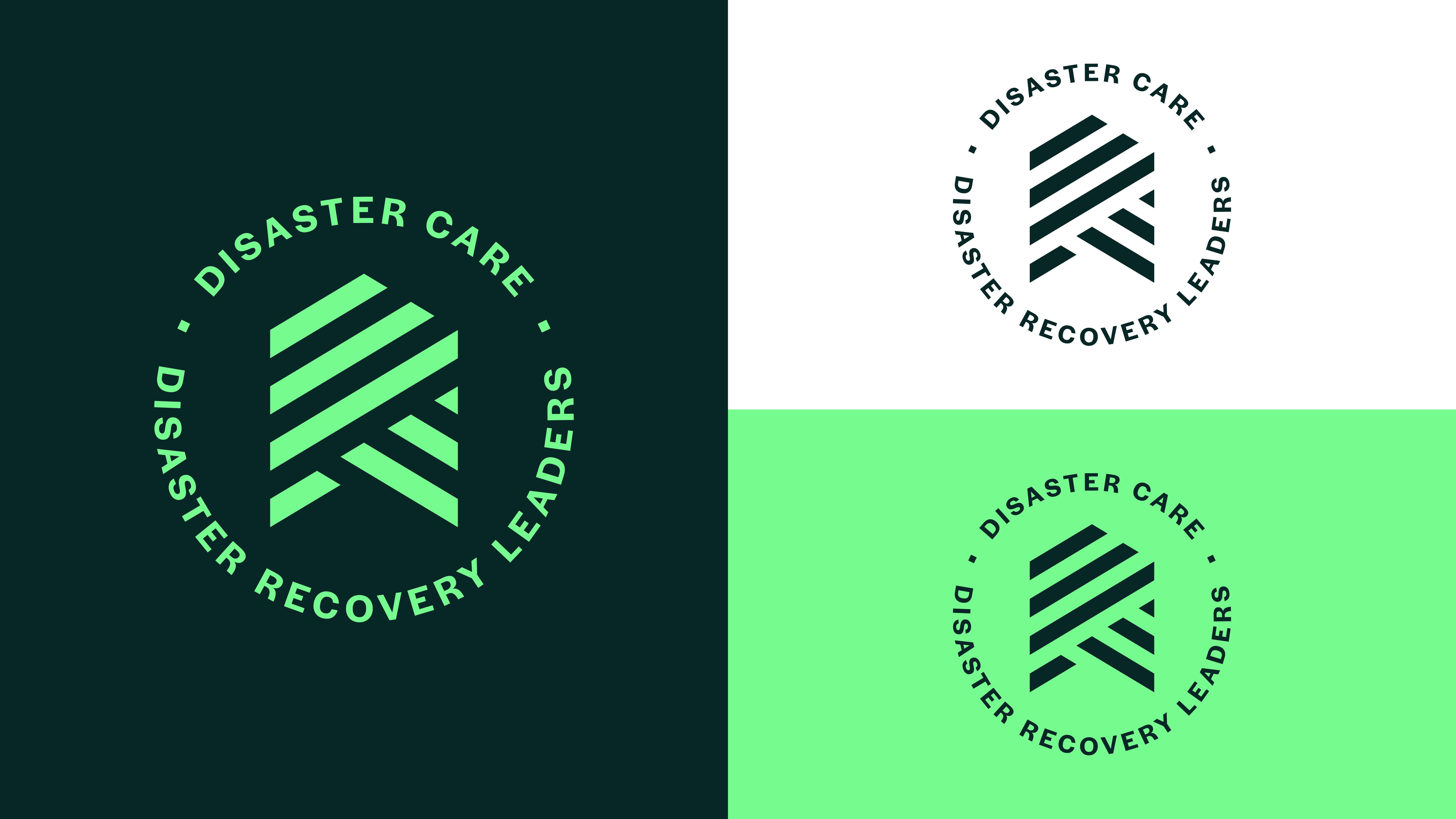
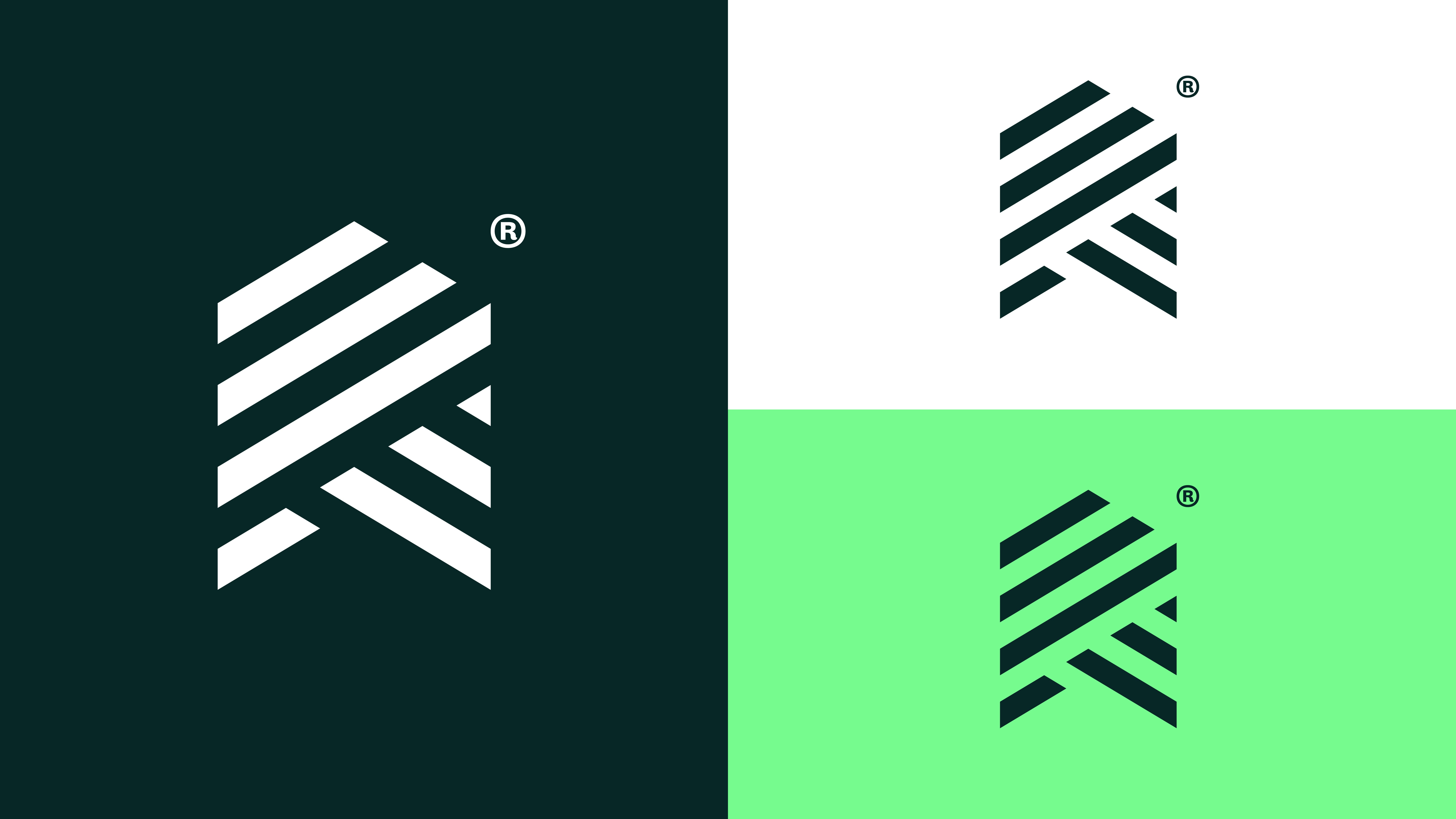
Colour Variants
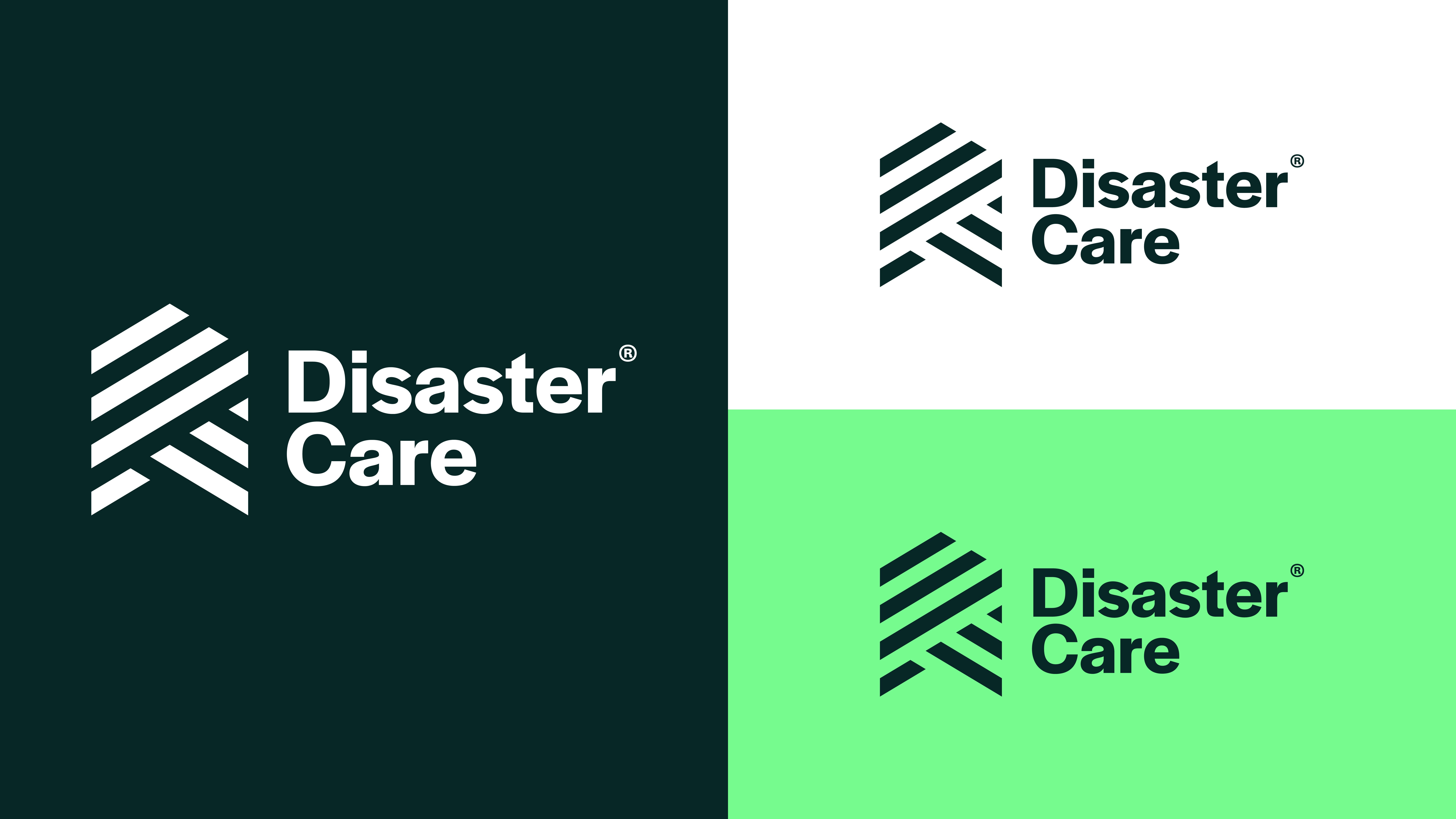
Our versatile logo suite includes a selection of colour variations. This allows the logo assets to be easily transferable depending on application. These should be used mindful of the approved colour pairings and contrast levels.
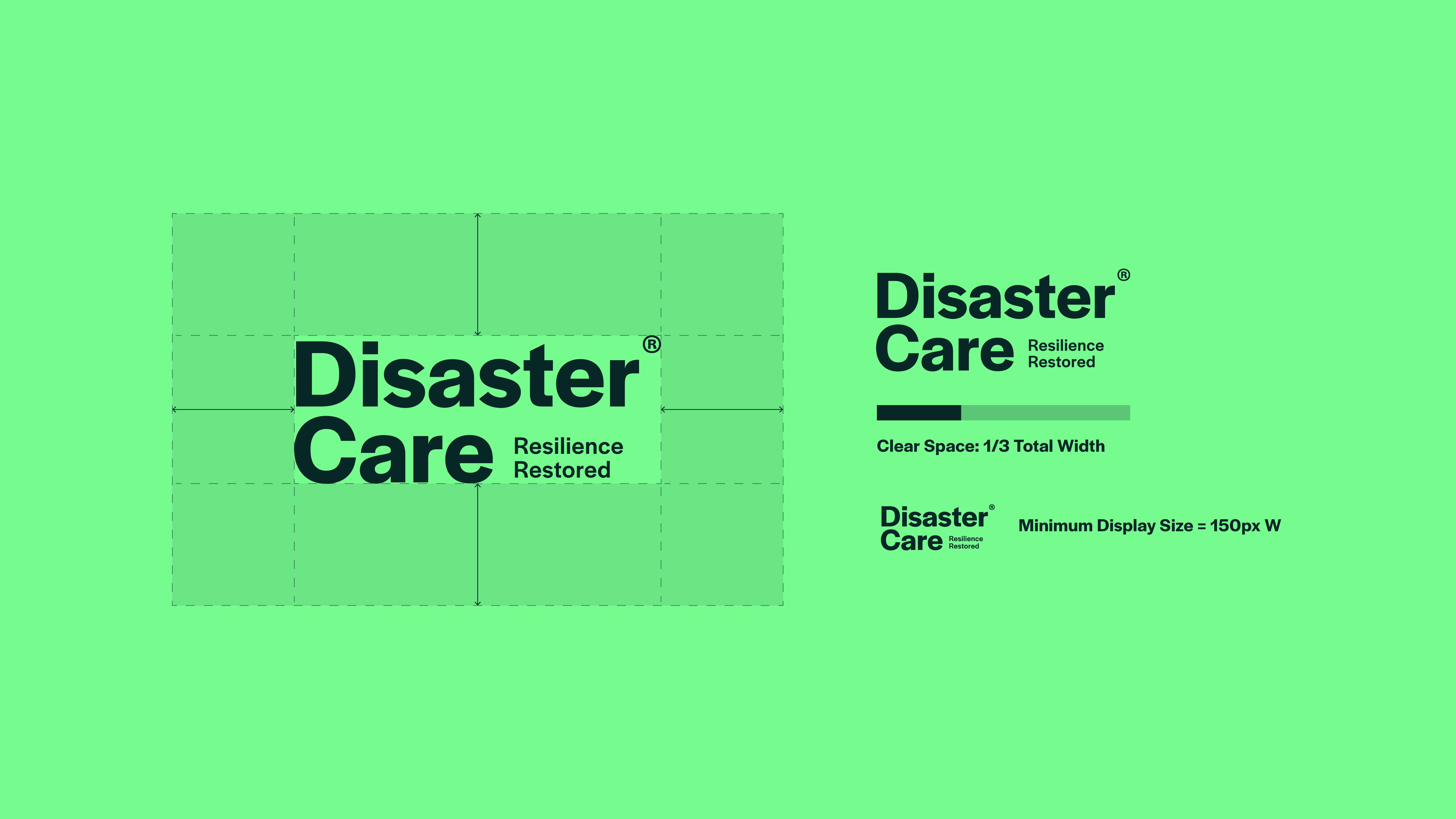
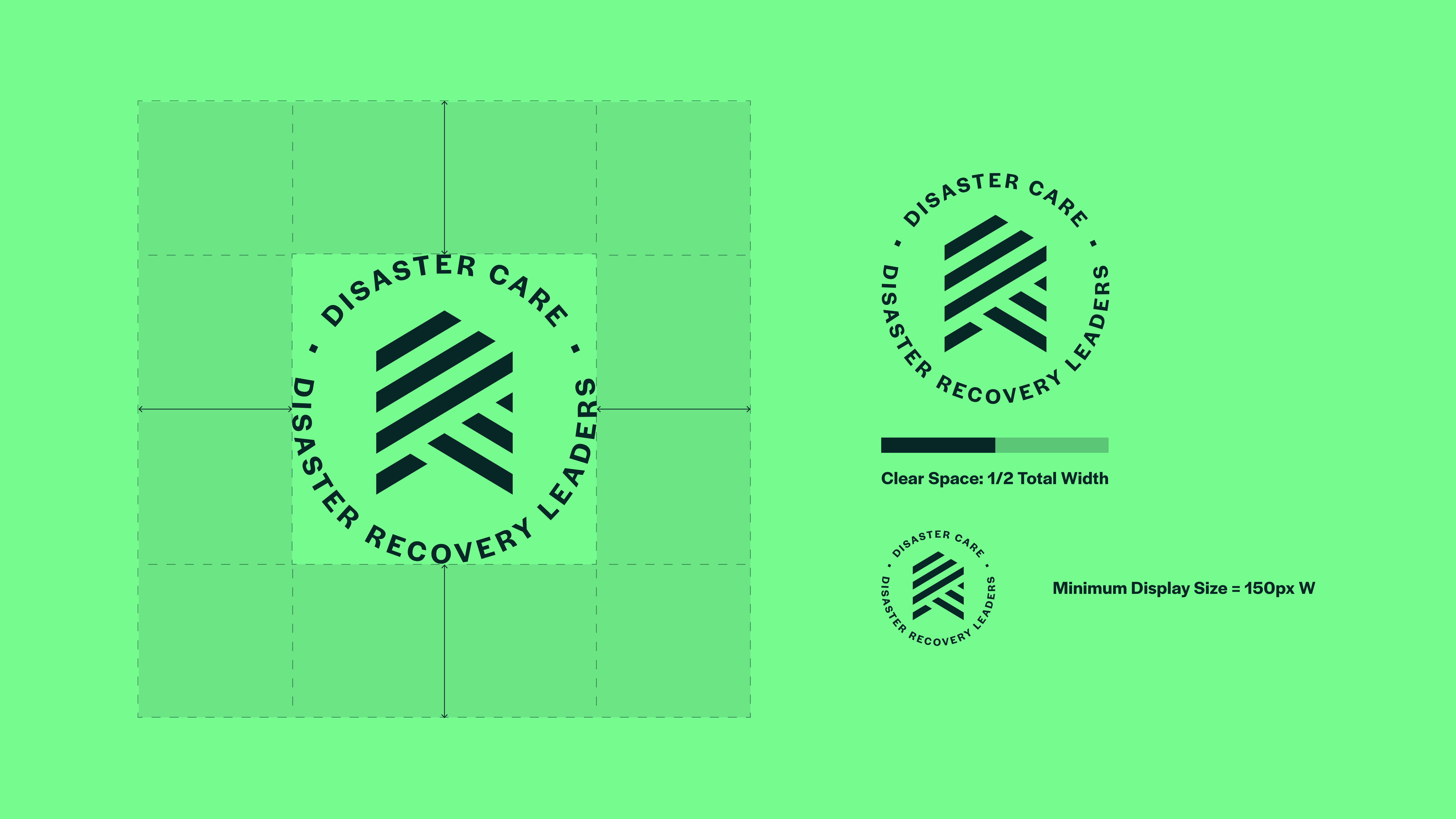
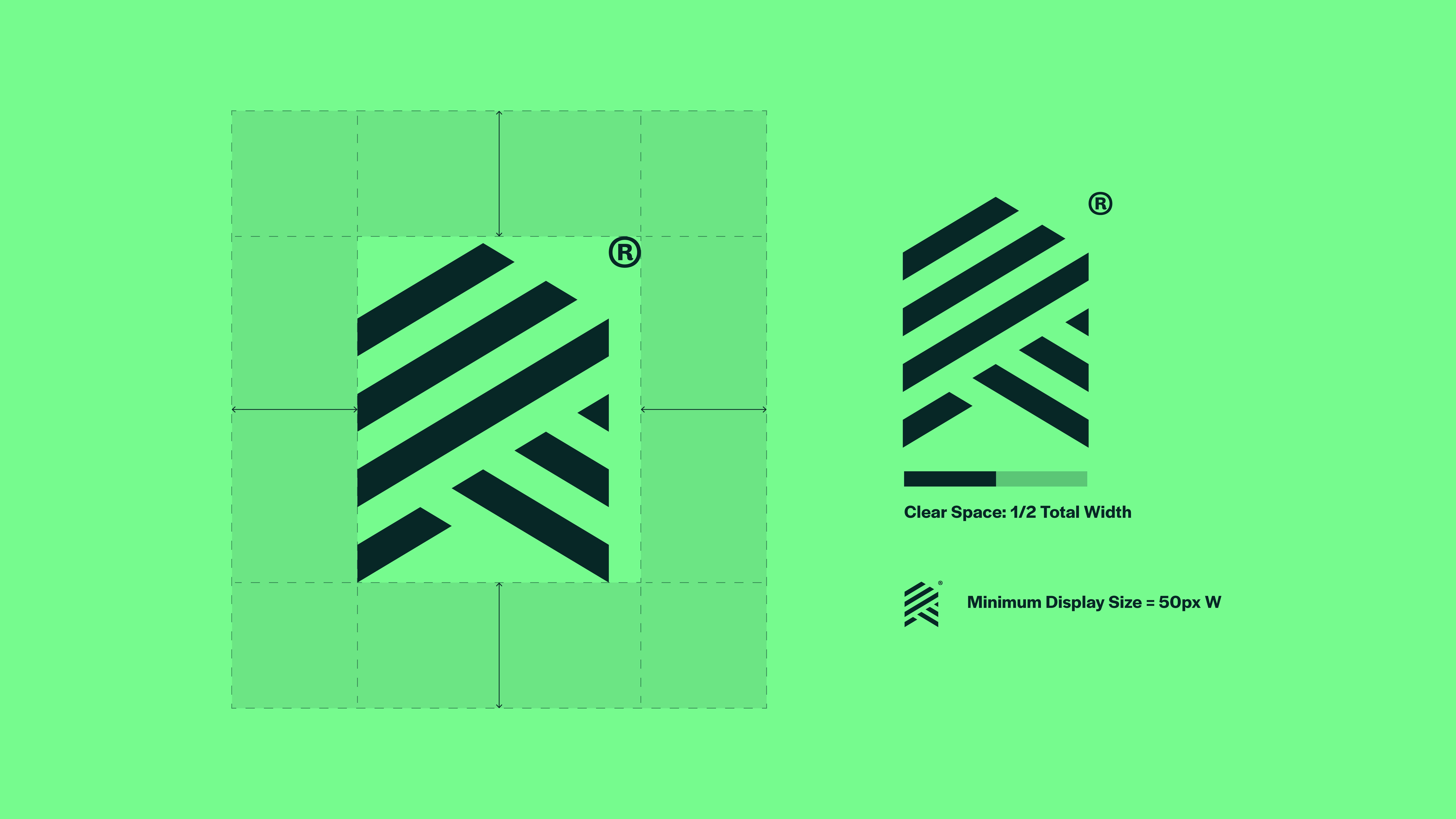
Clear Space & Minimum Size

When using the Disaster Care logo suite, always leave enough clear space around it. This helps the logo stay easy to see, read, and understand.
Clear space means keeping other text, images, and design elements away from the logo. This reduces visual clutter and ensures the logo stands out, especially when it appears alongside other content.
The minimum clear space around the primary logo is equal to one quarter of the logo’s total width. This rule helps keep spacing consistent as the logo is resized and prevents other elements from appearing too close.
This spacing should be used as a guide, as shown in the example.
The minimum display size for this logo is 150 pixels wide. The logo should not be shown smaller than this, as reducing it further may make it difficult to read.
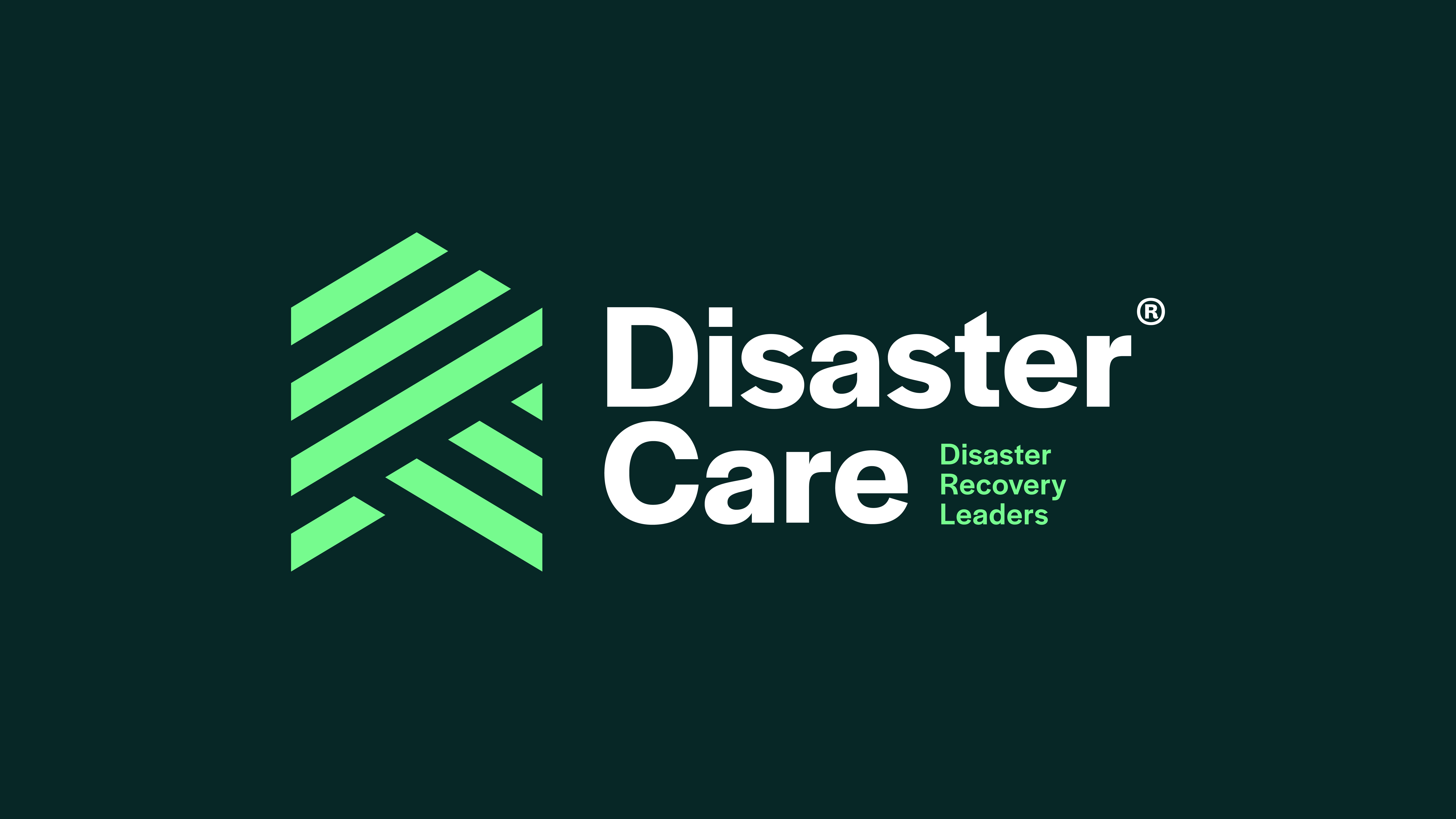
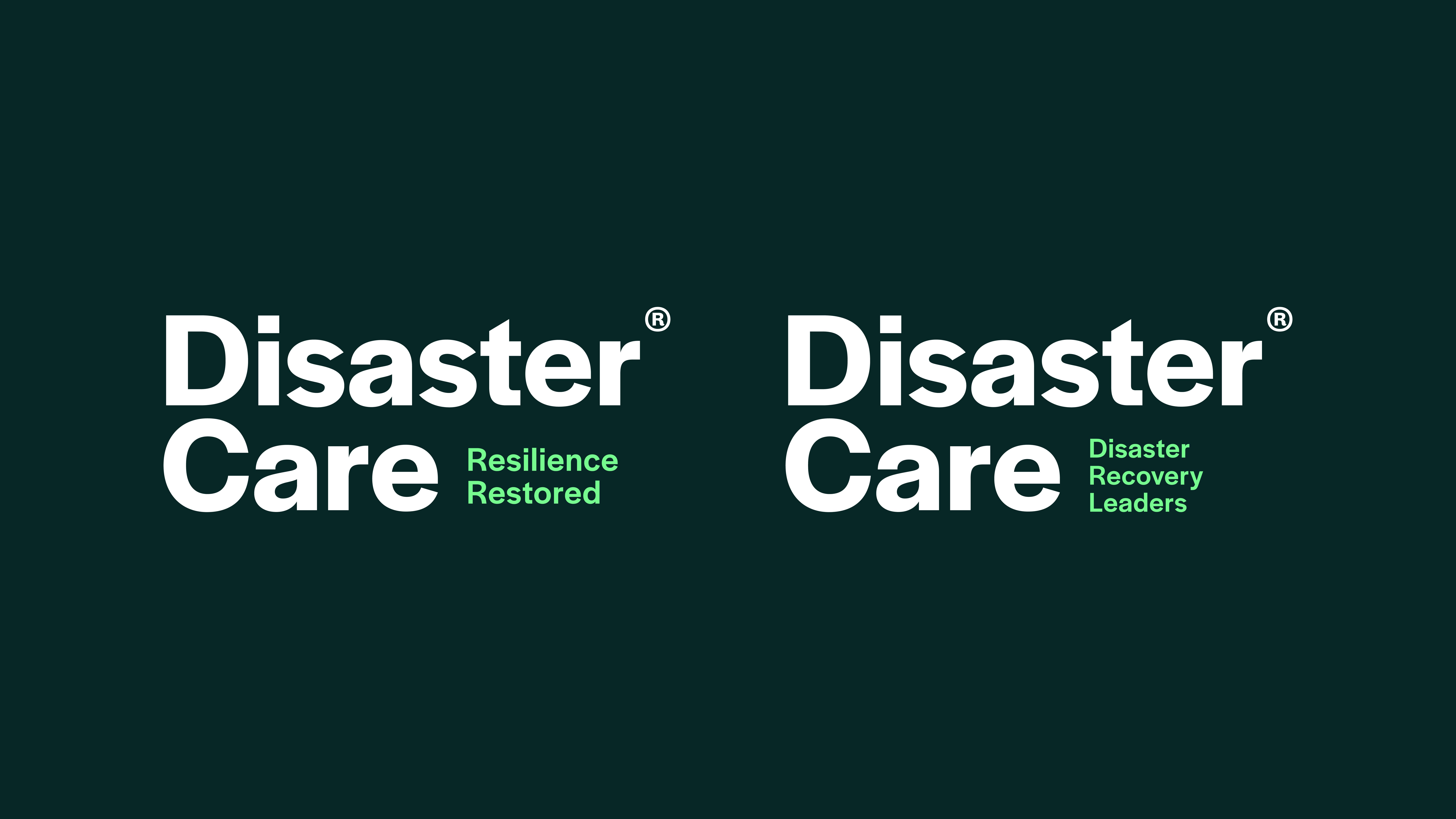
Emotive Strapline Lockup
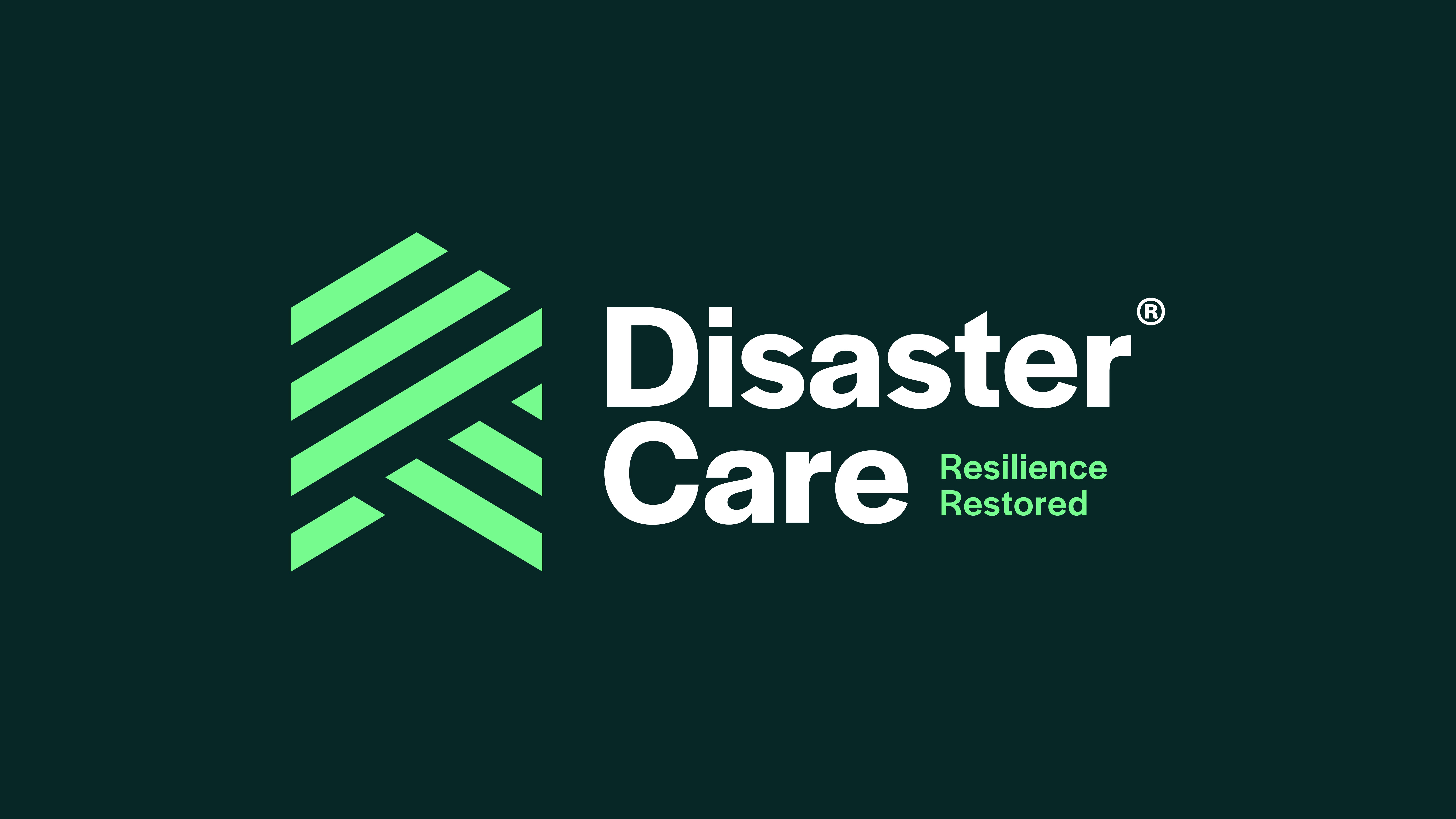
Supplied in the Disaster Care toolkit are multiple variations of the emotive strapline lockup. All variants should maintain position at the top of the visual hierarchy and mirror the placement of the primary logo when the emotive element is required when producing brand collateral.
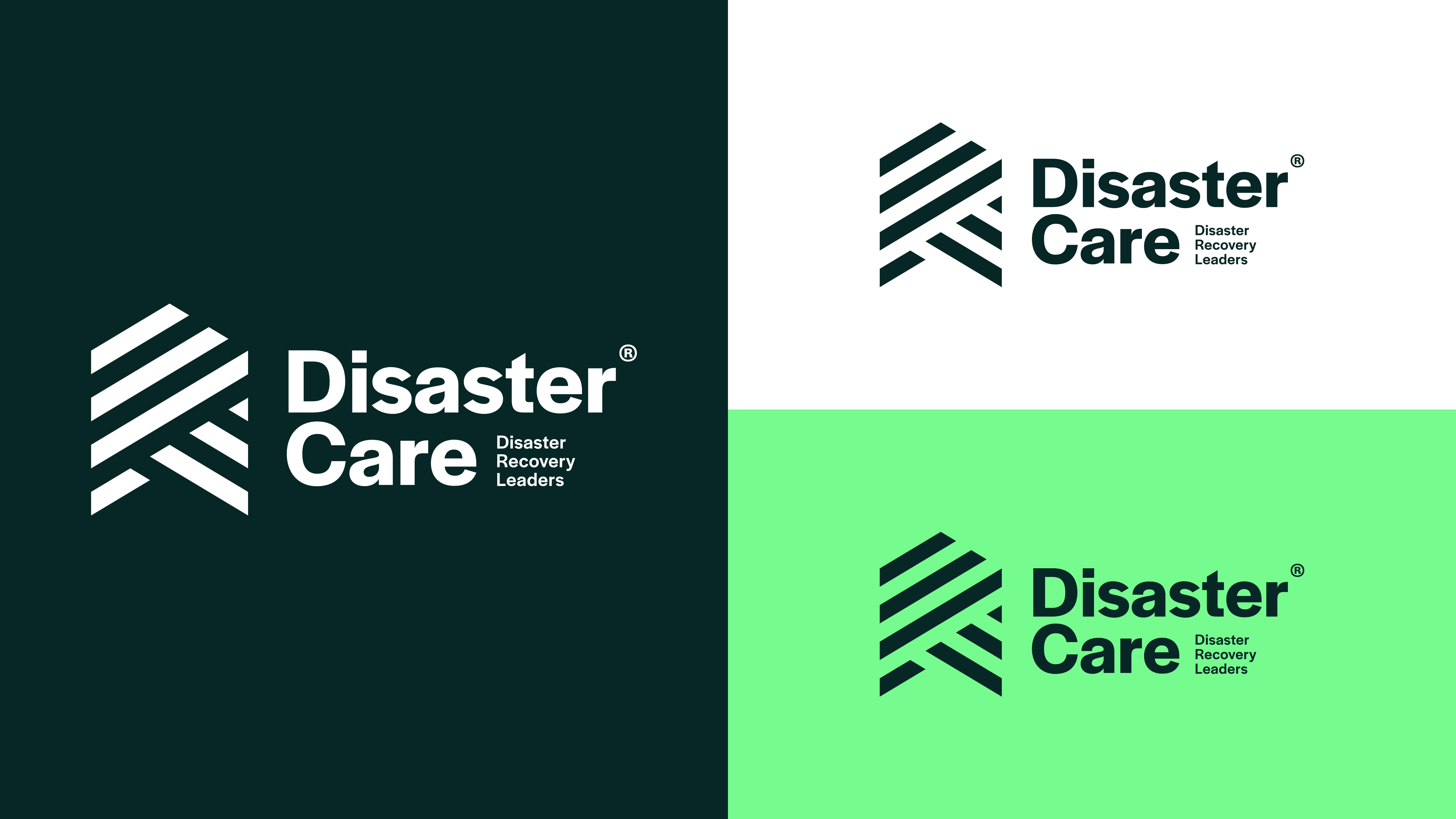
Colour Variants
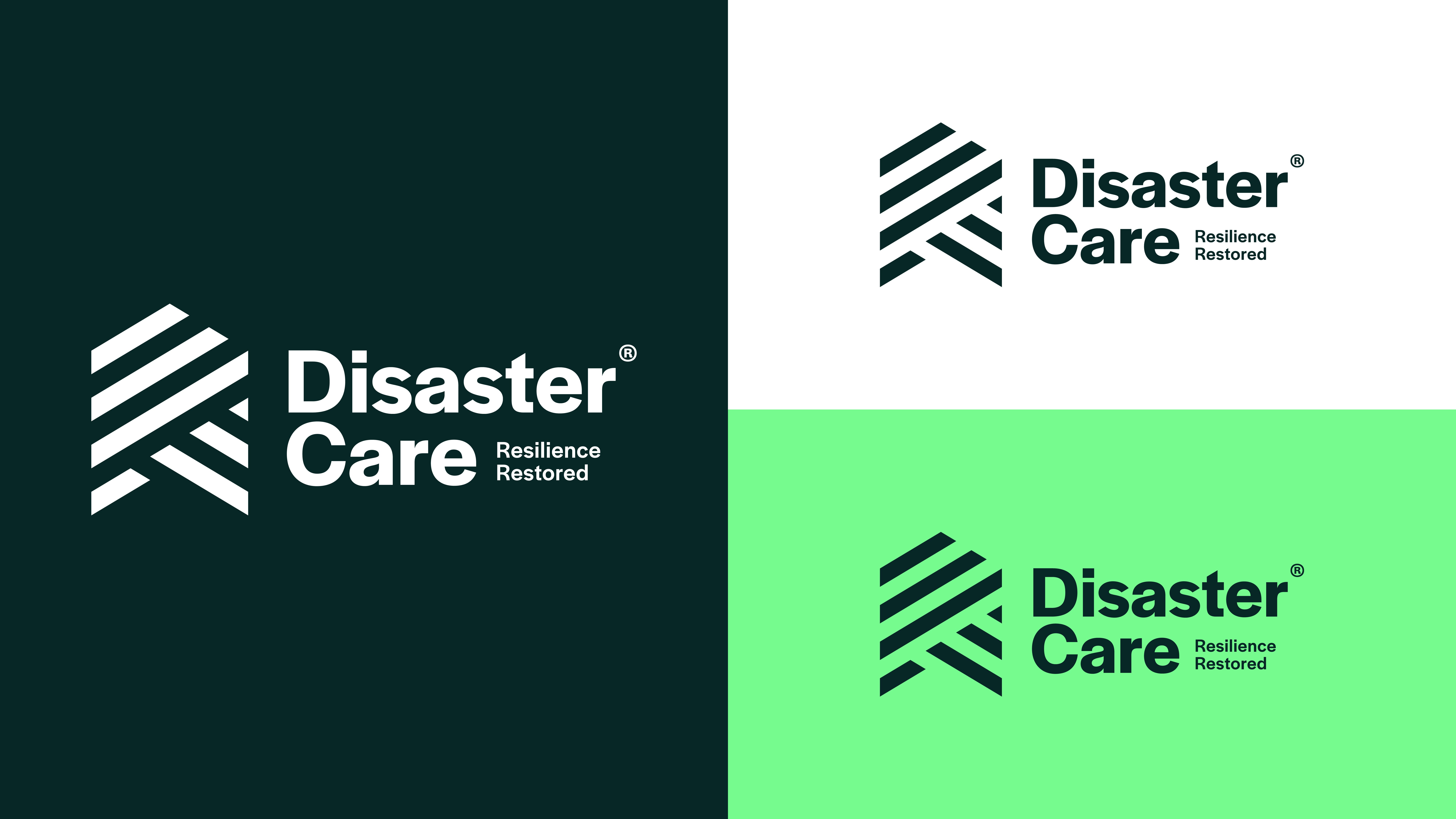
Our versatile logo suite includes a selection of colour variations. This allows the logo assets to be easily transferable depending on application. These should be used mindful of the approved colour pairings and contrast levels.
Clear Space & Minimum Size
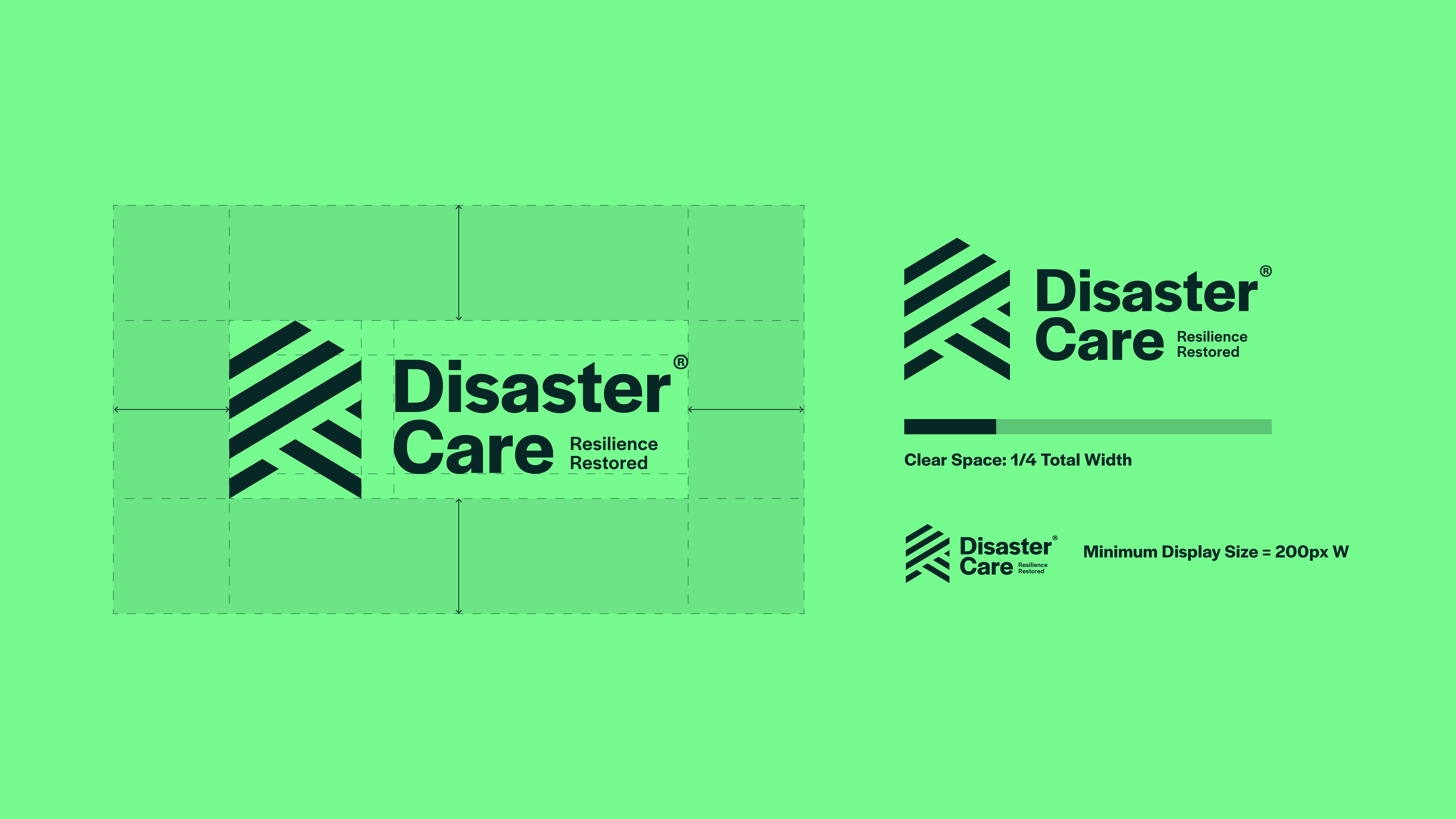
The minimum clear space around the emotive strapline lockup is equal to one quarter of the logo’s total width. This rule helps keep spacing consistent as the logo is resized and prevents other elements from appearing too close.
This spacing should be used as a guide, as shown in the example.
The minimum display size for this logo is 200 pixels wide. The logo should not be shown smaller than this, as reducing it further may make it difficult to read.
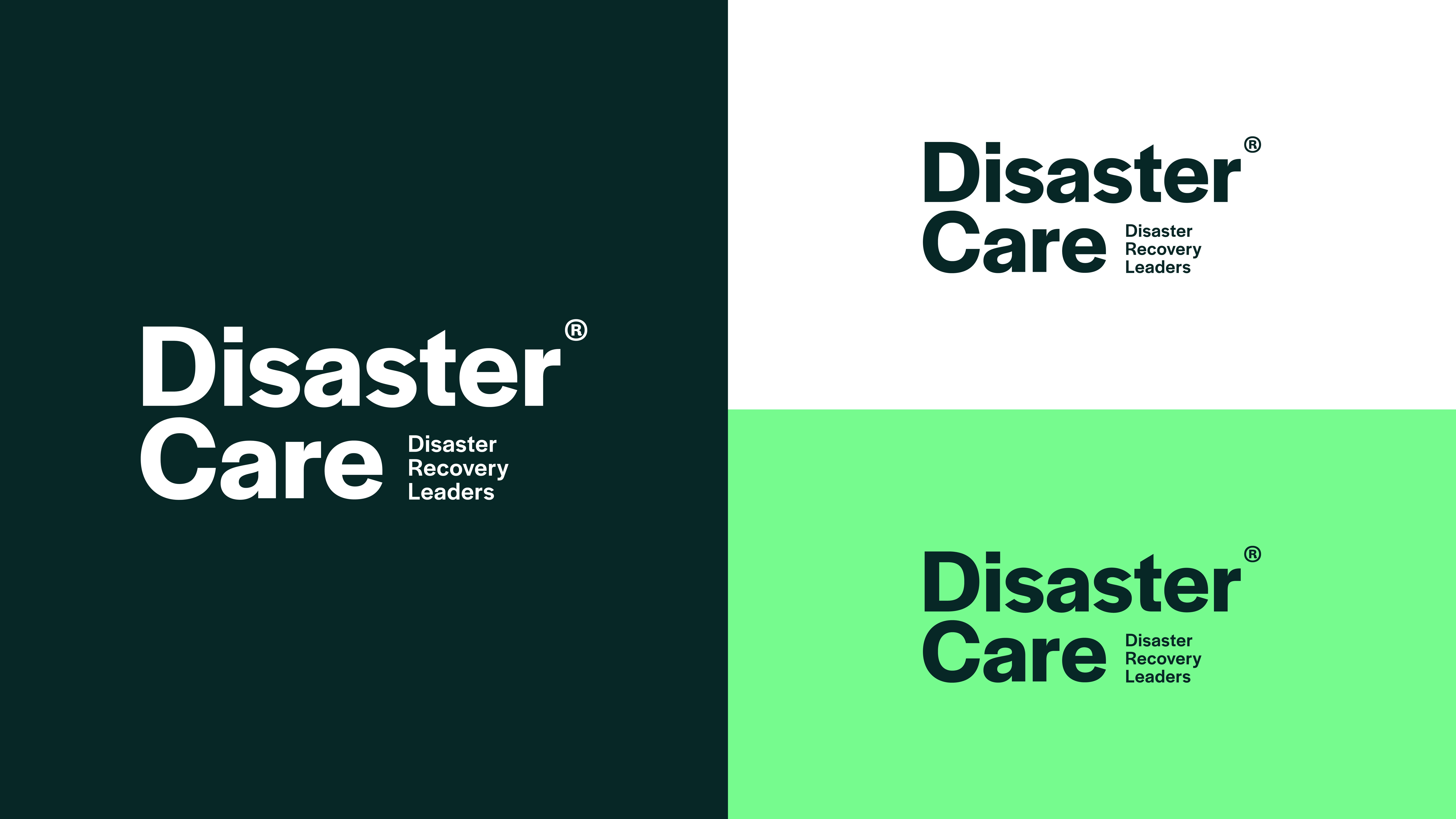
Descriptor Strapline Lockup
Supplied in the Disaster Care toolkit are multiple variations of the descriptor strapline lockup. All variants should maintain position at the top of the visual hierarchy and mirror the placement of the primary logo when the emotive element is required when producing brand collateral.
Colour Variants
Our versatile logo suite includes a selection of colour variations. This allows the logo assets to be easily transferable depending on application. These should be used mindful of the approved colour pairings and contrast levels.
Clear Space & Minimum Size
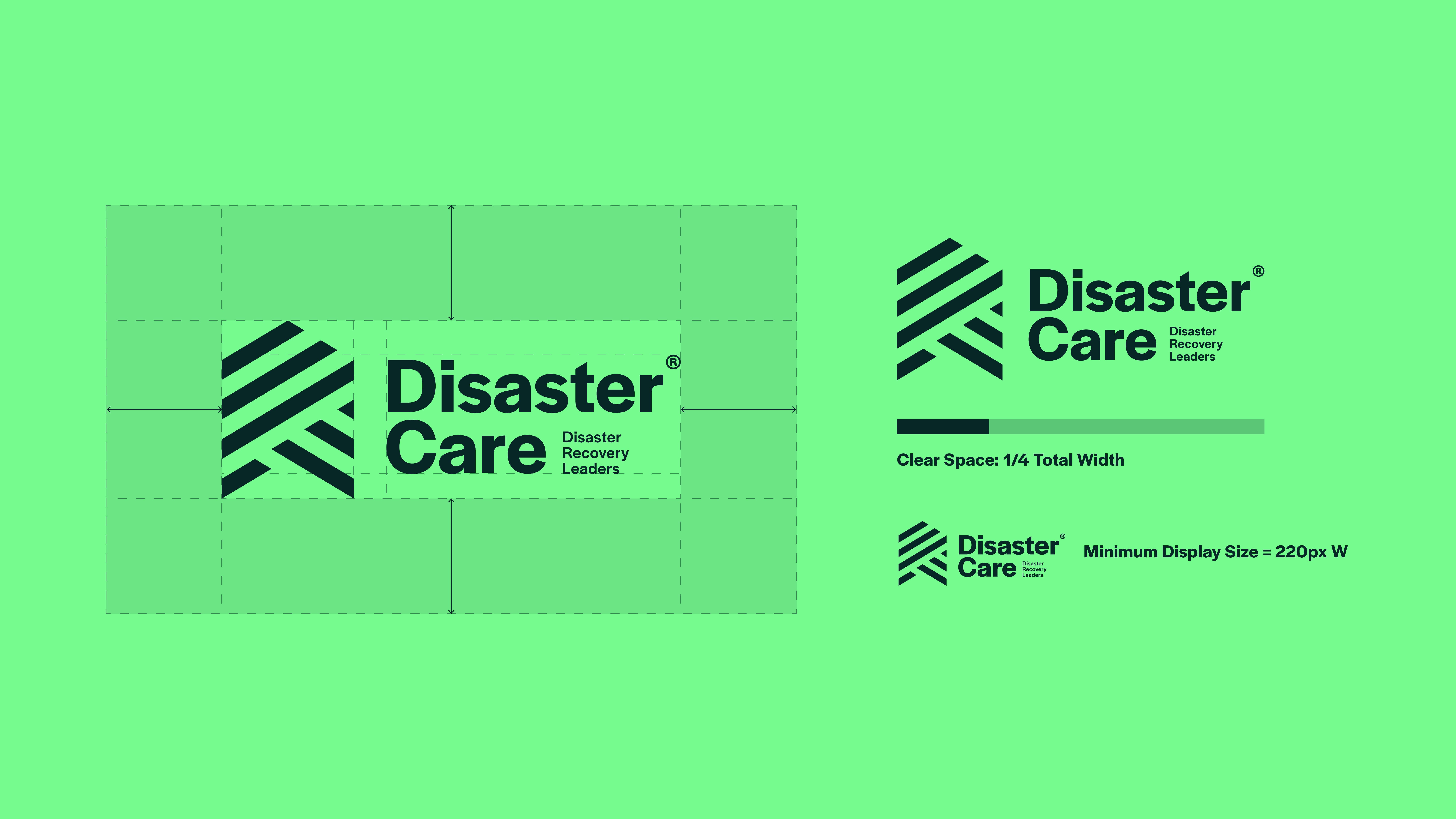
The minimum clear space around the descriptor strapline lockup is equal to one quarter of the logo’s total width. This rule helps keep spacing consistent as the logo is resized and prevents other elements from appearing too close.
This spacing should be used as a guide, as shown in the example.
The minimum display size for this logo is 220 pixels wide. The logo should not be shown smaller than this, as reducing it further may make it difficult to read.
Logotype Variants
Supplied in the Disaster Care toolkit are multiple variations of the logotype with both the emotive and descriptor strapline lockups. All variants should maintain position at the top of the visual hierarchy and mirror the placement of the primary logo when the use of the full lockup is not appropriate e.g. more formal documentation.
Colour Variants
Our versatile logo suite includes a selection of colour variations. This allows the logo assets to be easily transferable depending on application. These should be used mindful of the approved colour pairings and contrast levels.
Clear Space & Minimum Size
The minimum clear space around all logotype variants is equal to one third of the logo’s total width. This rule helps keep spacing consistent as the logo is resized and prevents other elements from appearing too close.
This spacing should be used as a guide, as shown in the example.
The minimum display size for this logo is 150 pixels wide. The logo should not be shown smaller than this, as reducing it further may make it difficult to read.
Badge Logo
Supplied in the Disaster Care toolkit are multiple variations of the badge logo. All variants should maintain position as a supporting element beneath a primary lockup in the hierarchy and should never be used in their place. This asset is to be utilised as a descriptor device and supporting visual asset only.
Colour Variants
Our versatile logo suite includes a selection of colour variations. This allows the logo assets to be easily transferable depending on application. These should be used mindful of the approved colour pairings and contrast levels.
Clear Space & Minimum Size
The minimum clear space around the badge logo is equal to one half of the logo’s total width. This rule helps keep spacing consistent as the logo is resized and prevents other elements from appearing too close.
This spacing should be used as a guide, as shown in the example.
The minimum display size for this logo is 150 pixels wide. The logo should not be shown smaller than this, as reducing it further may make it difficult to read.
Downloads
Icon Device
Supplied in the Disaster Care toolkit are multiple variations of the icon device. All variants should maintain position as a supporting element beneath a primary lockup in the hierarchy and should never be used in their place. This asset is to be utilised as a supporting visual asset only or in the case where a reduced representation of the logo is required where space is limited e.g. social media profiles.
Colour Variants
Our versatile logo suite includes a selection of colour variations. This allows the logo assets to be easily transferable depending on application. These should be used mindful of the approved colour pairings and contrast levels.
Clear Space & Minimum Size
The minimum clear space around the icon device is equal to one half of the logo’s total width. This rule helps keep spacing consistent as the logo is resized and prevents other elements from appearing too close.
This spacing should be used as a guide, as shown in the example.
The minimum display size for this logo is 50 pixels wide. The logo should not be shown smaller than this, as reducing it further may make it difficult to read.
Adaptability For Pattern
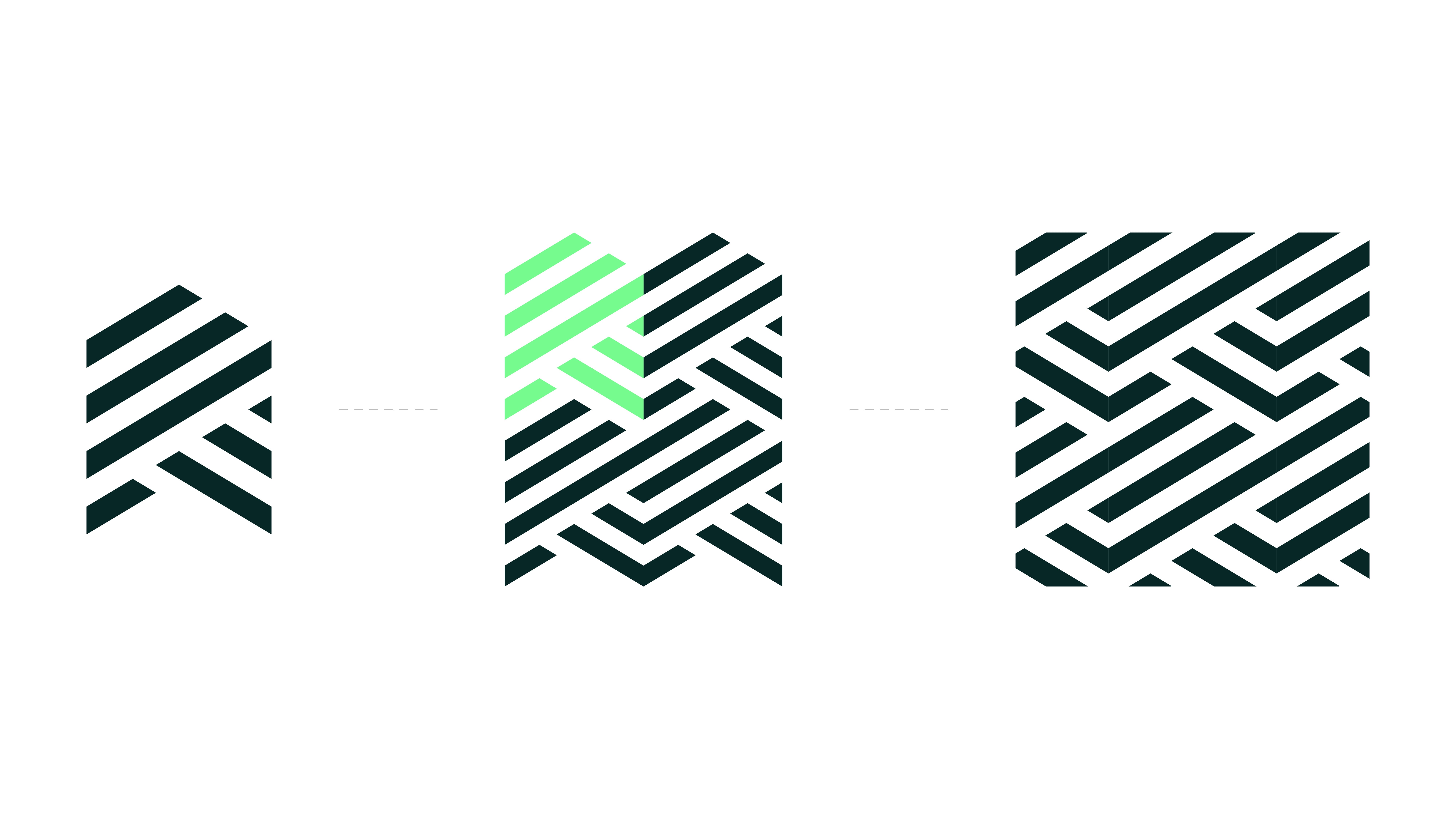
The structure and anatomy of the logo mark allows for it to be stacked into a repeat pattern which can be integrated into collateral as a visual embellishment to enhance brand presence and memorability. This should be used sparingly as overuse can be overpowering and detract from key messages. Moreover, this pattern should never cover a large area.
Reduced Pattern Device

Supplied in the Disaster Care toolkit are multiple variations of the reduced pattern device. All variants should maintain position as a supporting element in collateral and should never be used as a standalone representation of the brand, but instead only as an image treatment or page asset to enhance written content.
‘Care in the Community’ Device
Supplied in the Disaster Care toolkit are multiple variations of the icon device. All variants should maintain position as a supporting element beneath a primary lockup in the hierarchy and should never be used in their place. This asset is to be utilised as a supporting visual asset only where reference to the care in action services is required.
Colour Variants
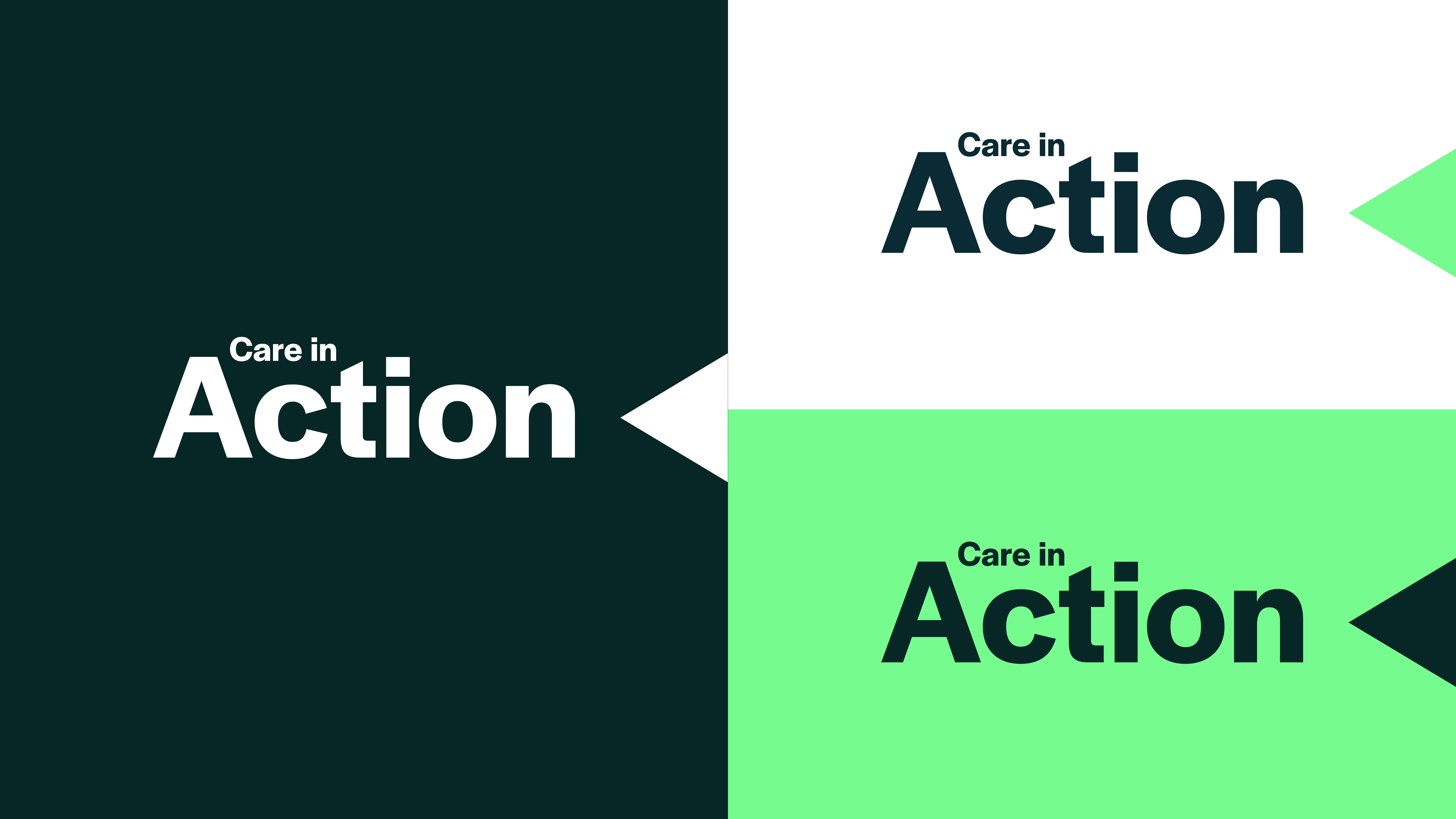
Our versatile logo suite includes a selection of colour variations. This allows the logo assets to be easily transferable depending on application. These should be used mindful of the approved colour pairings and contrast levels.
Clear Space & Minimum Size
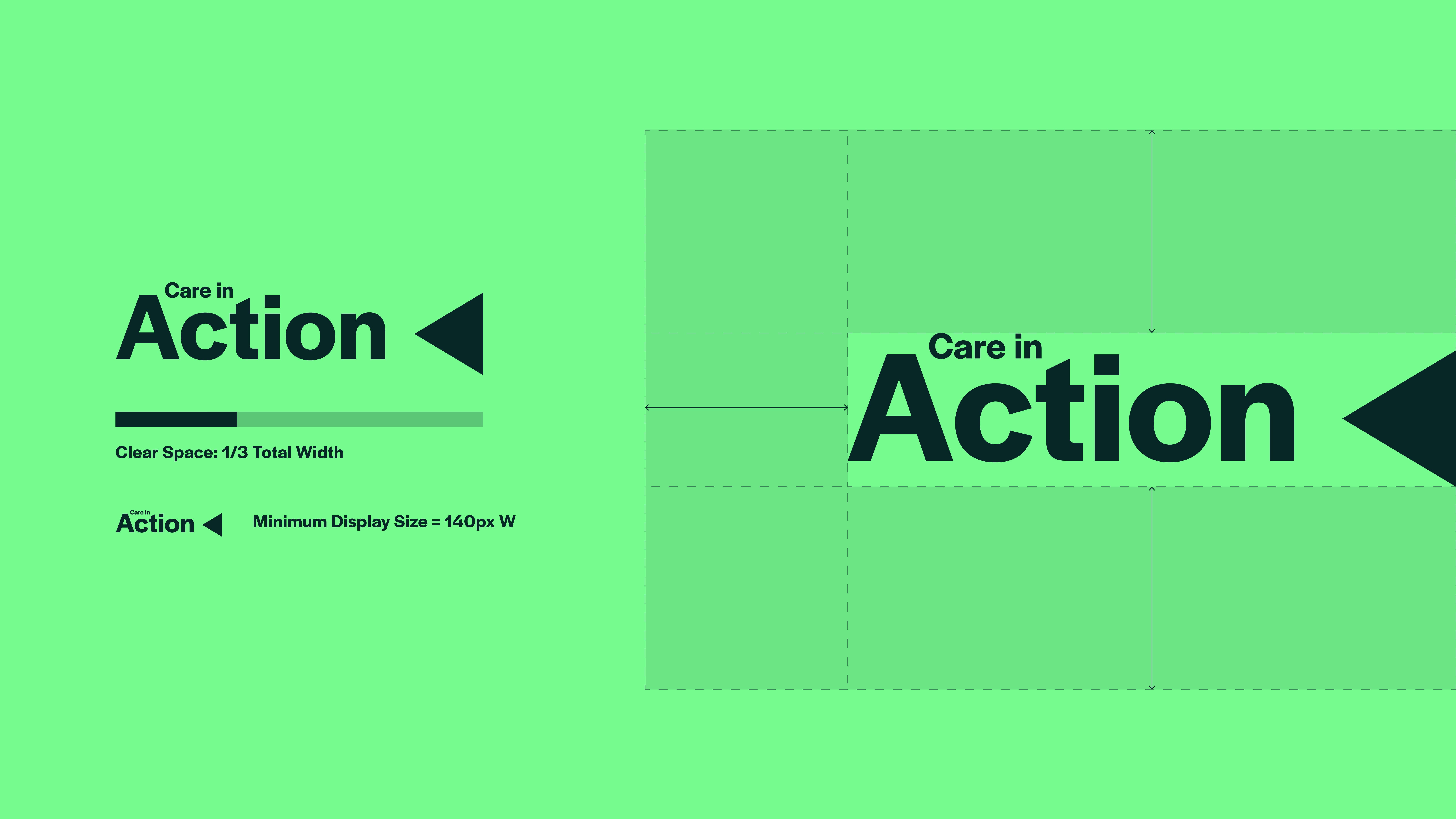
The minimum clear space around the care in action device is equal to one third of the logo’s total width. This rule helps keep spacing consistent as the logo is resized and prevents other elements from appearing too close.
This spacing should be used as a guide, as shown in the example.
The minimum display size for this logo is 140 pixels wide. The logo should not be shown smaller than this, as reducing it further may make it difficult to read.