Primary Brand Typface
Inter
Available From
Google Fonts
Disaster Recovery Leaders…
Inter Thin
Disaster Recovery Leaders…
Inter Extra Light
Disaster Recovery Leaders…
Inter Light
Disaster Recovery Leaders…
Inter Regular
Disaster Recovery Leaders…
Inter Medium
Disaster Recovery Leaders…
Inter Semi Bold
Disaster Recovery Leaders…
Inter Bold
Disaster Recovery Leaders…
Inter Extra Bold
Disaster Recovery Leaders…
Inter Black
Disaster Recovery Leaders…
Inter Extra Black
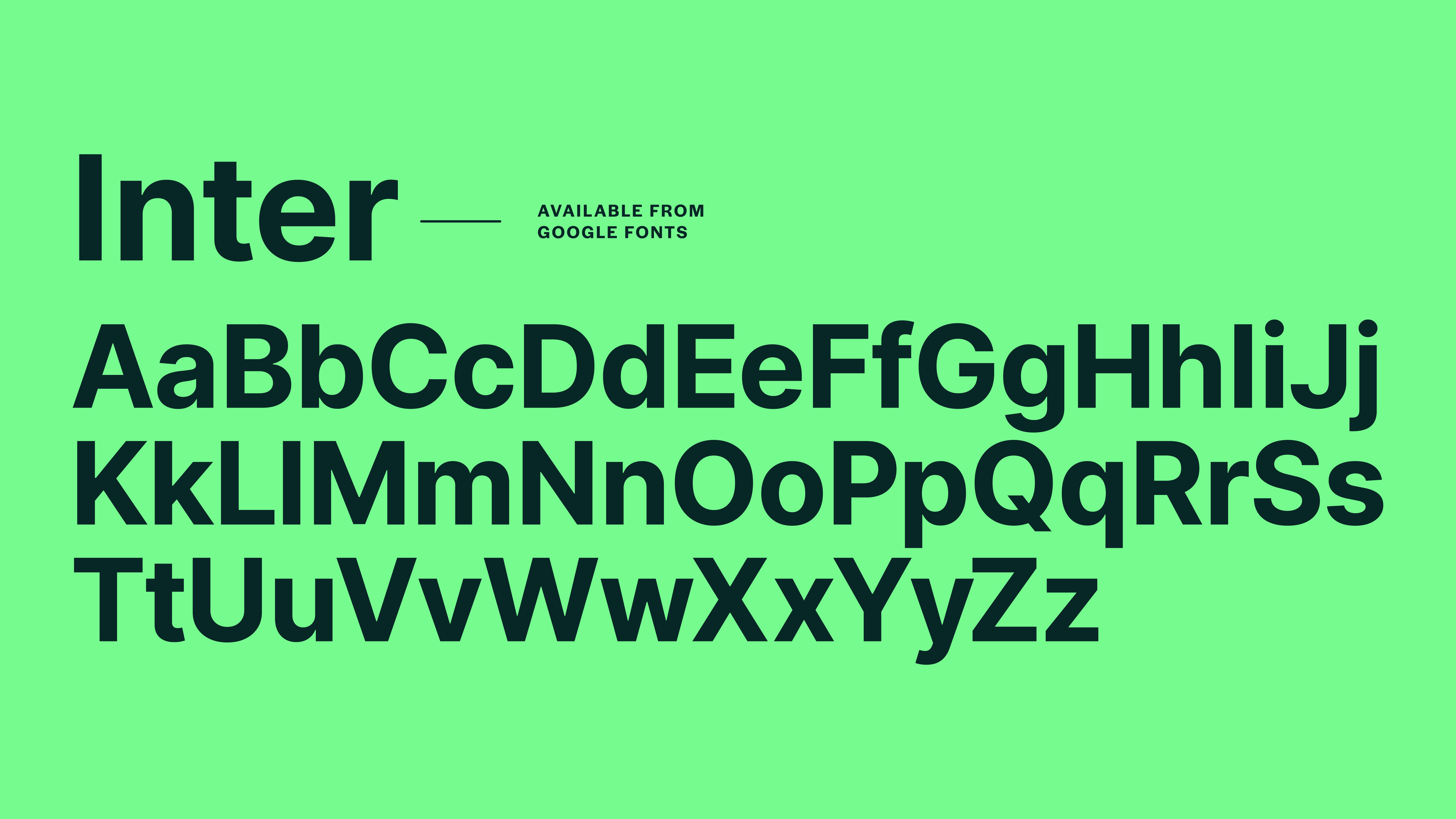
Inter is the primary typeface that has been assigned for use across all collateral and brand application under Disaster Care. This should be used in both print and digital contexts for all items at all levels of application.
Best Practice Type Scaling
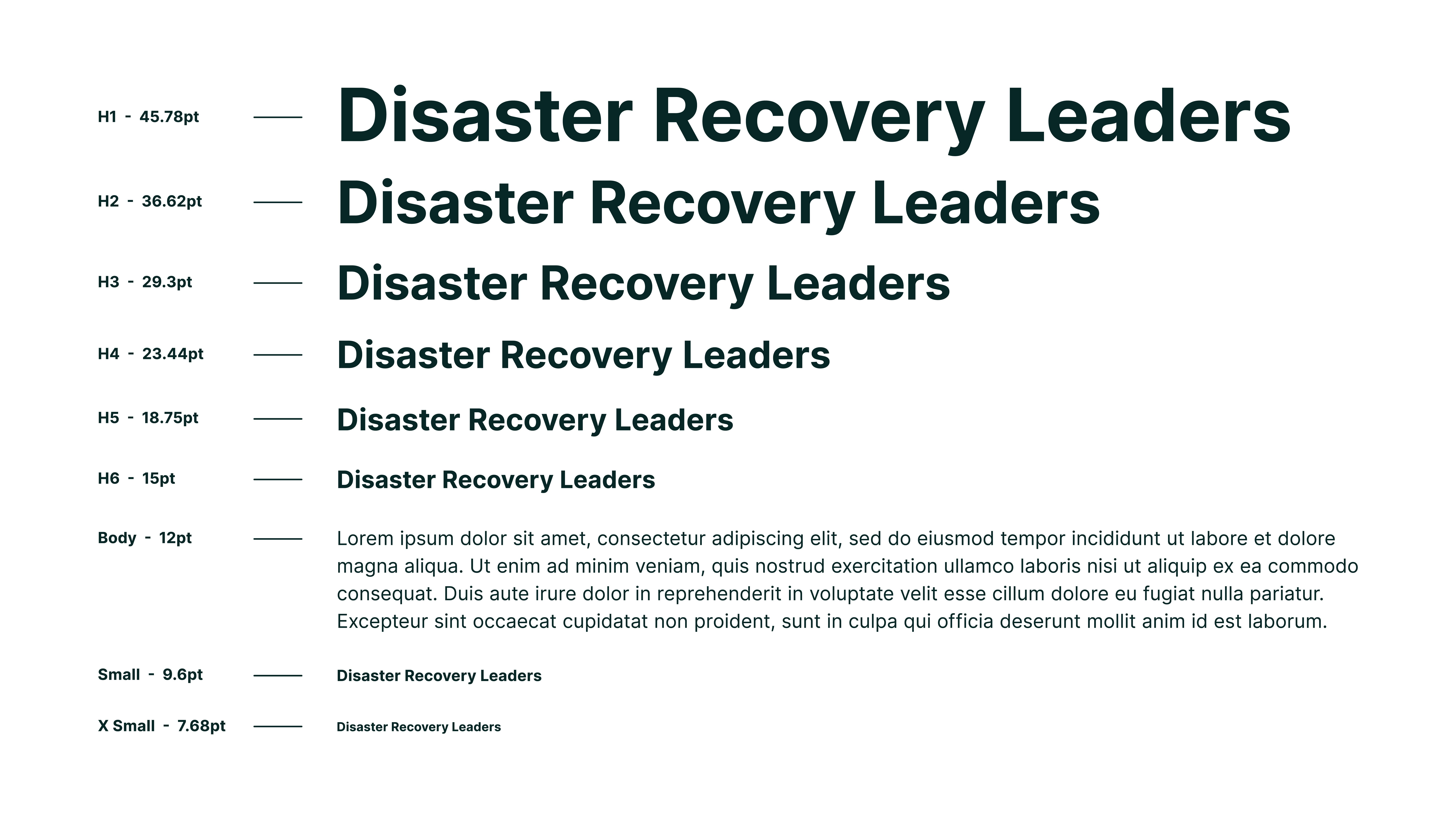
When using the Inter typeface, make sure text is sized and spaced clearly so it is easy to read and understand.
Good spacing and clear size differences help people recognise what information is most important, such as headings, subheadings, and body text.
This visual reference should be used as a guide for best practice when applying typography across all Disaster Care materials. It helps ensure written content is clear, consistent, and accessible.
Typographic Hierarchy & Composition

This visual should be used as a guide to show how typography can be applied clearly and consistently across Disaster Care materials.
Clear spacing helps key messages stand out and makes it easier for readers to understand the order of information.
Exact measurements are not always required. As a general guide, leave a space between the heading and the body text that is about the same height as the capital letters in the heading.
Because this spacing relates to the size of the heading, it will scale naturally as the text size changes, helping to keep layouts consistent.